Thinking of an designing a new office ??? here are a few tips to create a positive environment through interiors
Colors are the smiles of nature!! That quote from Leigh Hunt says it all. When you`re designing or renovating an office, color isn`t just an afterthought,it`s a powerful tool that can shape the mood, energy, and even the culture of the workspace. The right color scheme can motivate employees, boost creativity, and align your office with the company`s values. Let`s get specific: choosing colors isn`t just about what looks good; it`s about what feels good, what resonates with your brand, and how your office space functions day-to-day.
September 19, 2024
1. Align Colors with Your Company’s Brand Identity
The first thing to consider? Your brand’s personality. Color is a visual extension of your identity. What do you stand for? What vibe does your company want to project? This will steer your palette in the right direction.
-
Bold and energetic companies: If your brand is all about innovation, think tech start-ups or marketing agencies, you’re probably looking for something bold! Try shades of vibrant orange or electric blue. A splash of "Tangerine Tango" by Pantone or "Cobalt Blue" can infuse energy into collaborative spaces. These shades boost creativity and confidence—ideal for companies where brainstorming is the heart of the business.
-
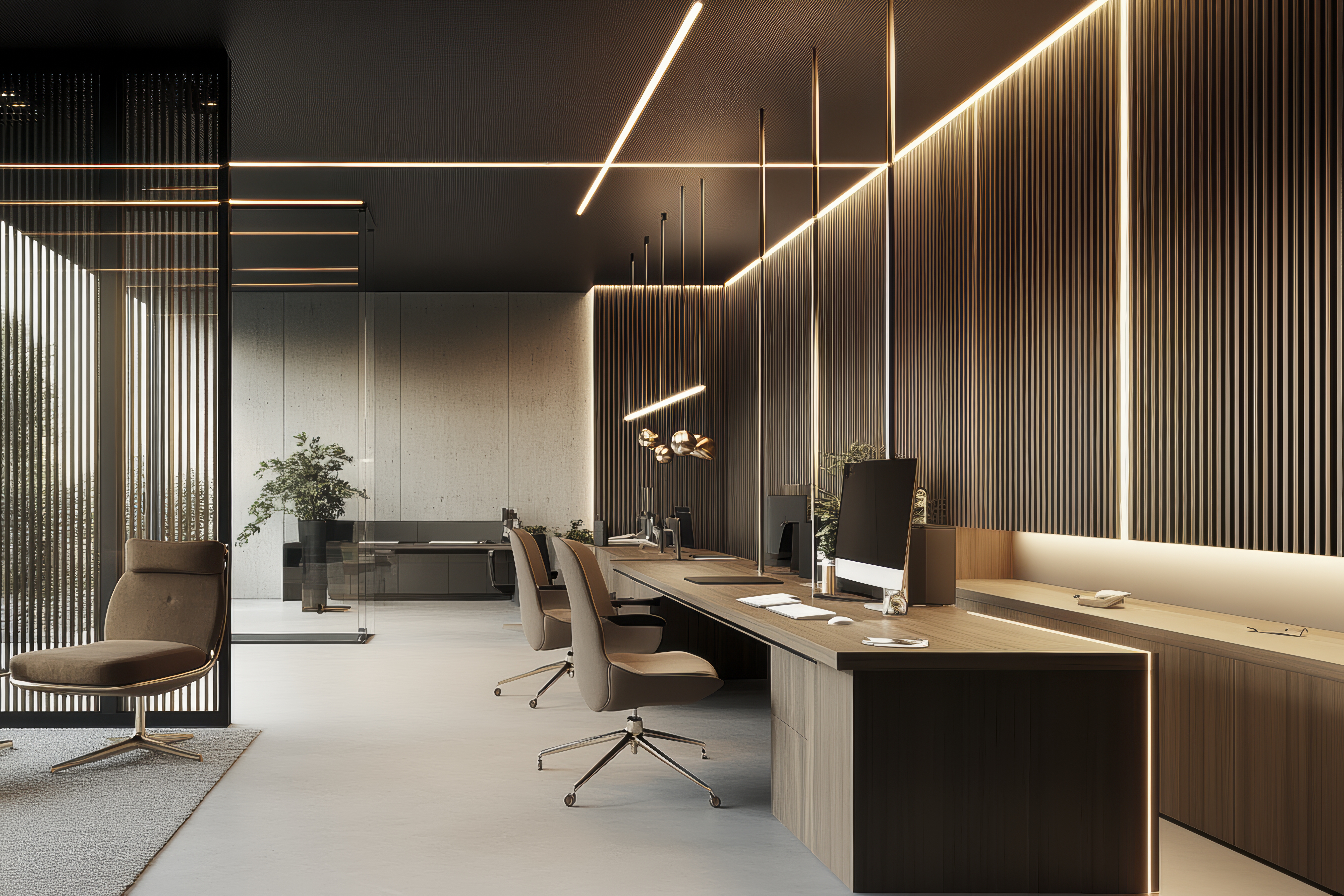
Classic and trustworthy: If your business is finance, law, or consulting, you want to project reliability and trust. Go for deep navy, rich burgundy, or charcoal gray. Think “Hale Navy” by Benjamin Moore or "Iron Mountain." These colors create a sense of professionalism and stability, perfect for spaces where important decisions are made daily.
-
Creative and artistic: For design studios or companies in the arts, where creativity needs to flow freely, consider a more eclectic mix of vibrant jewel tones—emerald greens, sapphire blues, or amethyst purples. These colors are stimulating without being overwhelming and foster an environment that encourages out-of-the-box thinking.
2. Reflect Your Company Culture in the Color Palette
Your office should feel like your culture, too. Does your company prioritize collaboration? Or is focus and calm your thing? Let’s break it down!
-
Collaborative and dynamic: If your company thrives on teamwork, choose open and inviting colors like bright yellows or warm whites. A color like “Sunflower” by Sherwin-Williams creates an atmosphere of energy and positivity. Combine it with soft accents in pale gray to balance the brightness and keep the space approachable, not overstimulating.
-
Focused and quiet: If your culture leans toward focus and deep work (think software development firms or R&D), go for calming tones like soft greens or light blues. “Sea Salt” by Sherwin-Williams or "Soft Fern" by Benjamin Moore are great choices. These colors have been shown to reduce stress and increase concentration, making them perfect for spaces that need to stay tranquil and grounded.
-
Flexible and adaptive: For hybrid offices that need to do it all—collaboration, focused work, and everything in between—neutrals with pops of color work wonders. Use a base of warm beige, like “Edgecomb Gray” by Benjamin Moore, and add bursts of personality with accents of burnt orange or cobalt blue in furniture or artwork. This creates a flexible foundation where different activities can thrive.
3. Use Color to Define Zones
Let’s face it: a one-size-fits-all approach doesn’t work for modern offices. Different tasks require different environments. Use color to clearly define areas for various activities!
-
Open collaborative zones: Paint these areas in bright and energizing hues like yellow, orange, or light teal. “Optimistic Yellow” by Behr can do wonders for creative zones where you want energy and ideas to bounce off the walls—literally! This kind of boldness fosters interaction and makes group discussions feel more vibrant and engaging.
-
Quiet focus areas: Use softer, cooler tones like sage green, pale blue, or warm gray to promote concentration. “Silver Mist” or “Pale Smoke” by Benjamin Moore are great for areas where focus and calm are crucial, such as reading rooms or quiet workspaces.
-
Meeting rooms: For rooms where decisions happen and presentations take place, use bold, grounding colors like deep gray, navy, or burgundy. These colors communicate confidence and help keep people centered. But here’s a tip: don’t overwhelm the room—use these colors on one accent wall or through furniture pieces to avoid making the space feel too heavy.
4. Consider Lighting and Color Harmony
Here’s a designer trick: lighting completely changes how a color looks. That chic “warm beige” you fell in love with on Pinterest? It could turn peachy under the wrong lighting! Test your colors under the lighting conditions of your office.
-
Natural light: If your space is flooded with natural light, go for cooler tones like soft blues, greens, or crisp whites. These colors won’t get washed out in the sunlight and will maintain their vibrancy throughout the day.
-
Artificial light: If your office relies more on artificial lighting, especially warm lighting, opt for warm neutrals like taupes, warm grays, or cream whites. Cooler colors under warm light can look dull or flat.
Pro Tip: Always test paint samples on different walls in your office and check them at various times of the day before committing. Trust me, it’s worth the extra step!
5. Infuse Personality with Accents and Textures
Colors don’t just live on the walls. Accents and textures bring the palette to life!
-
Accent furniture: Add color through furniture pieces—think orange office chairs, blue armchairs, or yellow couches in common areas. It’s a playful, low-commitment way to add bold hues without overwhelming the space.
-
Textures and materials: Combine your color choices with different textures. A rich emerald green velvet sofa or a navy leather chair creates a luxurious, tactile contrast to matte wall colors. Even natural wood finishes can act as a warm accent to cool-toned walls, grounding the space.
6. Tie It All Together
Consistency is key! Your office colors should flow, even if each space has its own unique purpose.
-
Brand consistency: If your company’s brand colors include blue and gray, use them as your base. But don’t feel trapped—add complementary colors to break up the monotony. For example, pair gray walls with pops of green in the décor or furniture, or add white to make the space feel more open and airy.
-
Cohesion through design: Use a unifying element like a similar trim color throughout the office or consistent flooring. This brings everything together even if the walls in different areas vary significantly
Designing or renovating an office with a brand-aligned color palette is more than just about aesthetics,it`s about creating an environment where your team can thrive! The colors you choose will influence the energy, mood, and creativity of everyone in the space. So be bold! Be thoughtful! And most importantly, make sure your office feels as good as it looks